
When we look at the psychology behind trust, a significant component is your target customer’s perception of your character. Trust has three primary facets: character, competence, and common goal.

Your logo stands as one of the most significant representations of your character
The perception of your character influence your value. The more you look like your service is worth, the more people are willing to pay for it.
All in all, we need a great looking logo. The good news, it’s easy to give someone a positive impression of your brand by following these simple guidelines. Send this article to your designer and use it as a checklist yourself.
We have guidelines because your logo needs to do more than any logo in history. There was a time when you needed one version of your logo. It would go on your materials, your business cards, your letterhead, and always look the same.
Today, logos need to be responsive.
They need to adjust. You can see a great example of this at http://responsivelogos.co.uk.
My favorite example is the Walt Disney Logo.
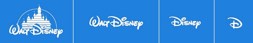
You can see how the logo changes depending on the amount of space it has available. While you don’t need to go this far with your logo, it does need to look great in several different mediums. This includes:
- Website (desktop, tablet, and mobile)
- Instagram (profile and any images you place your logo on)
- Rack cards
- Business cards
- Billboards
- Concierge stands
- Guidebooks
- Tshirts
- Schwag
- Promotions/Coupons
- Emails sent from your reservation system (Rezdy, Peek, Fareharbor)
- Newsletter emails (which you probably aren’t sending — let’s talk about that!)
So let’s get into it. What makes a great logo?
#1) Your logo should be simple
You should be able to draw your logo, by hand, from memory. If you cannot do this, your logo may be too complicated.
#2) Your logo should use meaningful symbolism
Let’s use the Chicago flag as an example of symbolism.
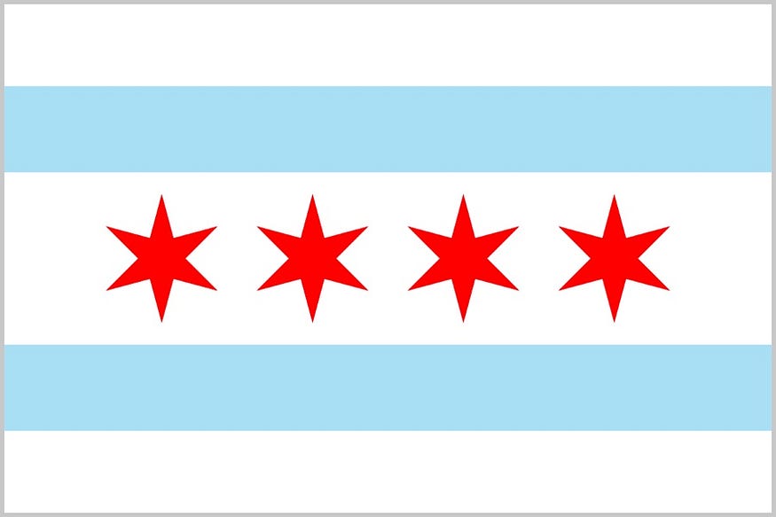
- The top blue stripe represents Lake Michigan and the North Branch of the Chicago River.
- The bottom blue stripe represents the South Branch of the river and the canal.
- The four stars represent significant events that shaped Chicago. These include Fort Dearborn (1812), the Great Chicago Fire (1871), the World’s Columbian Exposition (1893), and the Century of Progress Exposition (1933–34).
Then, you may not have noticed it, but even the white areas of the flag have meaning. The three white stripes represent the North, West, and South sides.
Now I am not saying you need to go this far with it — this is an extreme example. But we want meaning, a purpose for why each element is in your logo.
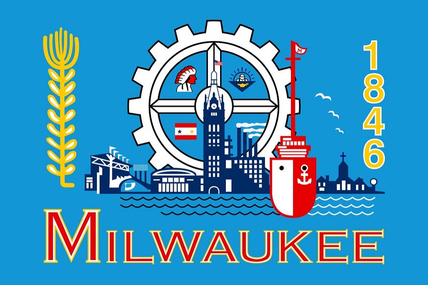
Just don’t go overboard like the city of Milwaukee tried to do. They actually have pictures of flags on their flag. I counted 7, but there may be more.
#3) Your logo should only use 1–3 colors
You don’t want to overwhelm someone with a rainbow of colors. Think of brands like McDonald’s, Coca-Cola, Facebook — they limit their color palette; you should also do this.
You also do not need to choose your colors based on theories about how they make someone feel. The emotional effects colors have on people is too broad. You can learn more about how this is subjective at https://goo.gl/wDTDf6
#4) Your logo should work in all black or all white
There will come times when your logo may need to appear in a single color, such as black or white. Your designer should provide you with a copy of your logo in all black and all white. If your logo cannot appear in all black or all white, you skipped #1.
#5) Your logo needs to look right at very small sizes and very large sizes
It needs to look great when someone pulls up your logo on a mobile phone, but it may also need to appear on a billboard. It should work as a tiny square for your social media profiles, and as a large graphic on the front of your guidebooks.
#6) Your logo should have vertical and horizontal versions
Similar to the previous point, and the area where we talked about responsive logos, it needs to be flexible. You may use a horizontal version across the top of your website to save screen real estate; but, that same horizontal logo is going to look awful squished into a social media profile box.
In conclusion
You need to work with a designer who understands the different demands of your logo. It can have a tremendous impact on the perceived value of your brand and whether someone wants to purchase tickets from you.
If your logo meets all of these guidelines, you’re in great shape. If your logo does not meet these guidelines, it could make it more difficult to work with and impact your perceived value.